
The display property tells the browser how to render an element in CSS.
There is nothing to it. And yet this article will try to show you that it can be a surprisingly complicated thing.
Those of you who know its basic values such as block or inline may be surprised that since 2020 we have had a new version of the specification that adds a whole range of further options — the “CSS Display Module Level 3”. w3.org/TR/css-display-3
Let’s start with a simple overview of the most useful values of the display property. You probably already know most of them.
| Value | How it renders |
|---|---|
inline | An inline-level element that creates no line breaks before or after itself (the default). |
block | A block-level element. It breaks the line before and after itself. |
inline-block | Internally a block-level element, externally inline, creating no line breaks. |
flex, inline-flex | Creates a flexbox layout. The inline variant does not break lines before and after. |
grid, inline-grid | Creates a grid layout. The inline variant does not break lines. |
table, inline-table | A table layout. The inline variant again forms a table within a line. |
none | Does not render the element, nor its descendants. |
The table is far from covering all the options and their specific behaviors, pitfalls, and tricks. So read on.
Did you know, for example, that…?
- With the
flow-rootvalue you no longer need a “clearfix” to contain floats, that is, to reset a floated layout? - Browsers now support multi-keyword values such as
inline flex? - Besides
none, there is also thecontentsvalue for hiding an element. And do you know what it can do?
Outer and inner display
The first thing we need to realize is the plain fact that, according to the specification, there are now two types of display:
- Inner display
The value of thedisplayproperty determines how the browser lays out the element’s descendants, in other words its inner elements. This is where values such asflex,grid, ortablebelong. - Outer display
The value defines how the element itself is displayed relative to its surroundings. The view from the outside. This is determined by values such asinline,block, ornone.
Got it? Excellent. This will come in handy once we start talking about multi-keyword values.
Outer display
Outer display essentially determines the role of the styled box in the page’s flow.
The display property. The outer display values are our old acquaintances.
This type of display includes the following values:
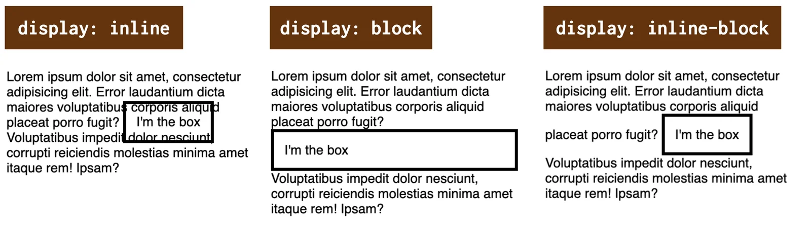
inline
Creates a box that is “inline-level”. It breaks nothing before or after itself, it simply renders within the line.block
Generates a box that is “block-level”. Put simply, this means it renders across the full width of its parent and breaks the line before and after itself.inline-block
Generates a box that behaves like an inline box on the outside and always generates a new block context on the inside. By the way, the specification treats this value going forward merely as another notation for the keyword pairinline flow-root. More on that later.run-in
Generates an “inline-level” box with special behavior — it tries to insert itself into the following block element. If a block element follows the “run-in” element, the “run-in” becomes its first inline box. If an inline field follows, the “run-in” element becomes a block element.
You can try all the options out in CodePen.
CodePen: codepen.io/machal/pen/wvzYXeg
The variant with the run-in display type is missing from my demo, because it is not supported anywhere other than Internet Explorer (!).
CodePen does not work in this granddaddy of browsers, so you would get nothing out of the demo. See support on CanIUse.
caniuse.com/run-in
The granddaddy is sadly dead by now, though, so you do not need to care about run-in either.
Inner display
Inner display values switch on a new formatting context inside the affected element (the term “formatting context” is used for this in CSS).
The formatting context affects the way inner elements are rendered, and possibly the behavior of properties applied to the element.
flow
Theflowvalue switches on flow formatting (“flow layout”). This is the normal way of displaying, which is automatically turned on by the valuesblock,inline, andinline-block. It is the default layout mode in CSS.flow-root
Creates a block context container (likedisplay:block) and lays out its content using flow (“flow layout”). Theflow-rootvalue, however, always generates a new block formatting context for its content, so you do not need to clear floats with a “clearfix”, for example. What is interesting about this value is that it is supported by all modern browsers.flex
Switches on the flexbox formatting context. It turns the styled element into a flexbox container and its direct descendants into flexbox items.grid
Starts the grid formatting context. It turns the styled element into a grid container and its direct descendants into its items.table
Turns the element into a table. In this case, however, there are two “containers”.display:tablegenerates a table container, which creates a block formatting context and contains an additionally generated table grid box, which creates the table’s formatting context.ruby
This is exotic and unnecessary in a Central European context. “Ruby annotations” are short runs of characters placed above or below the base text, used in East Asian typography as a pronunciation guide. Feel free to forget about it.
I have prepared two explanatory CodePens where you can test what you see in the image.
In the first one, we simply have three elements placed in a single parent, with no layout.
CodePen: codepen.io/machal/pen/KKgGeQQ
The second CodePen is more interesting. All three inner elements are “flowing”, floated:
.container p {
  float: left;
}
CodePen: codepen.io/machal/pen/WNGayad
You can see the result in the image.
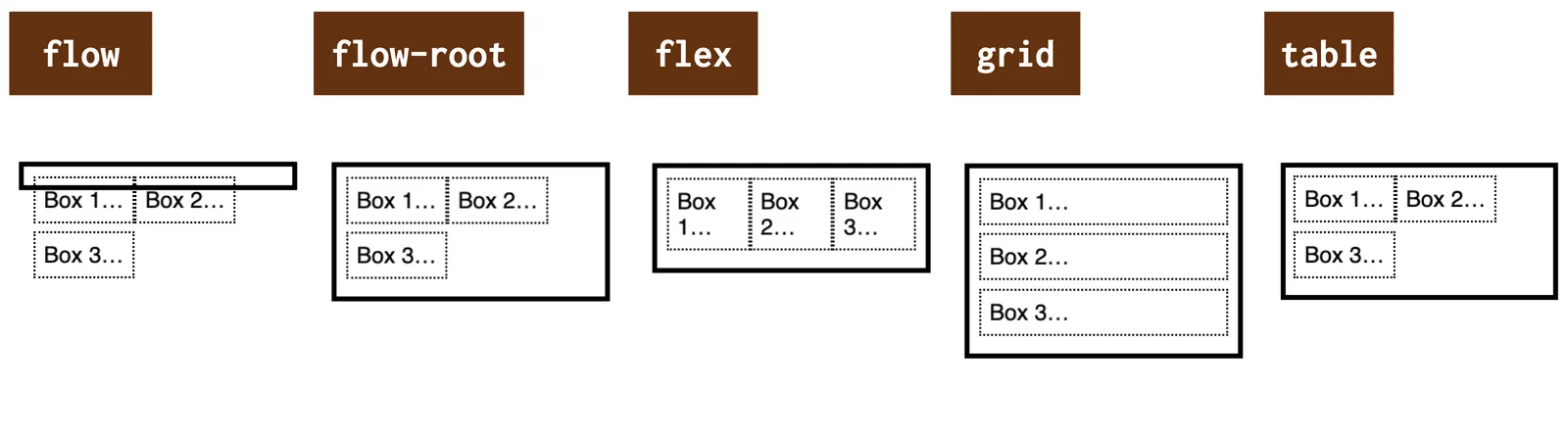
The inner display value options with inner floated elements.
- Normal flow display (
display:flow) cannot contain floats, we would need the aforementioned “clearfix”. display:flow-rootcontains floats, it always creates a new block formatting context.- Floats have no effect on
display:flexanddisplay:grid. - Floats do affect the inner elements in
display:table, because the parent here is in a normal block formatting context flow.
Let’s go through a few more specific values.
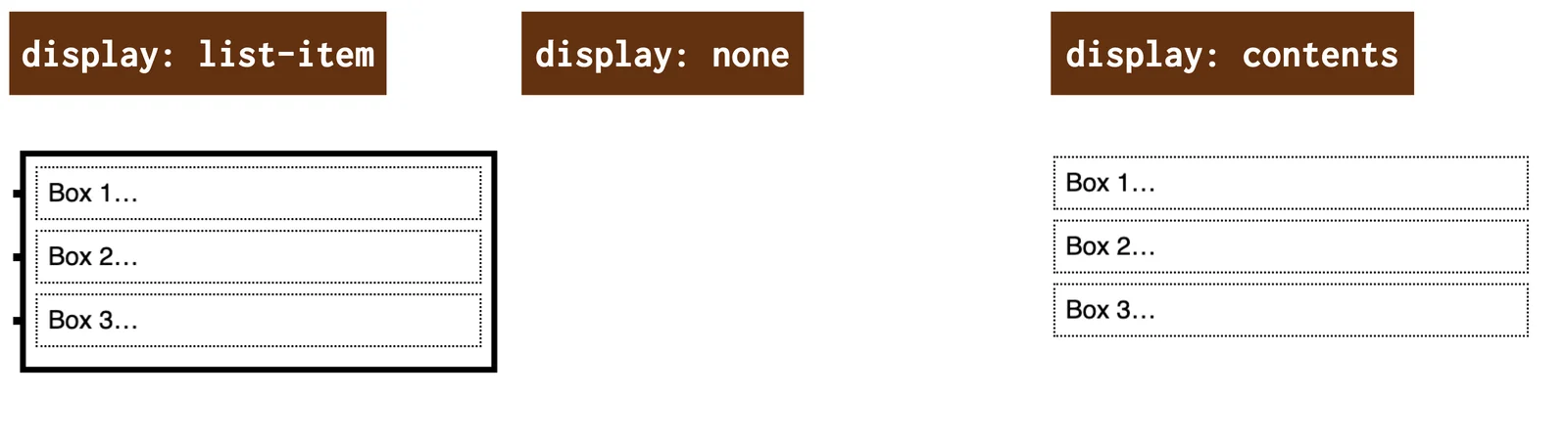
Generating boxes with markers: list-item
The display:list-item notation causes the element to generate a ::marker pseudo-element.
If no inner display type value is given, the default is flow — like display:flow. If no outer display type value is given, the default type is block — display:block.
Thanks to this, we can style our container as if it were a <ul> or <ol> element:
.container {
  list-style-type: square;
}
CodePen: codepen.io/machal/pen/gOwqJmq
The first example in the following image shows the list-item display type.
Other types of (non-)display in CSS.
We will discuss the second and third values from the image in the next section.
Hiding elements: the none and contents values
To all the possible methods of controlling how boxes are rendered to the screen, we must also add methods of not rendering.
The following two values of the display property serve this purpose.
none– neither the element nor its descendants are rendered to the screen at all.contents– the element itself is not rendered to the screen, but its descendants are.
The contents display type works as if the element were replaced in the DOM tree by its content (including pseudo-elements such as ::before and ::after).
CodePen: codepen.io/machal/pen/zYKmaMb
Display types for internal layout: the table- and ruby- values
Display models that force an internal layout, such as display:table and display:ruby, have a complex structure with several different roles that their descendants can fill.
As mentioned above, the display:table notation does create a table container, but that container creates a block formatting context.
So we do not achieve a tabular display this way. To do that we would need additional elements representing the rows and cells of the table with the correct display property values (table-row, table-cell…).
It is similar with display:ruby, only the inner elements are different.
Multi-keyword values
This is a new thing, added to the specification in the second half of 2020 by the last browser to do so, which was Chrome, implemented in 2023.
Do you remember when I wrote about the different types of display — inner and outer? If not, quickly skim the start of this text or its headings. Then you will understand why multi-keyword values for the display property make sense to me.
The single-keyword values above can in fact be taken as shorthands for multi-keyword notations of inner, outer, or specific display.
| Shorthand | Full notation | What is generated |
|---|---|---|
none | - | nothing |
contents | - | element omitted, descendants generated |
block | block flow | block box |
flow-root | block flow-root | block box that always creates a new block formatting context |
inline | inline flow | inline box |
inline-block | inline flow-root | inline box that always creates a new block context |
run-in | run-in flow | run-in box (an inline box with specific rules) |
list-item | block flow list-item | block box with an additional list item marker |
inline list-item | inline flow list-item | inline box with an additional list item marker |
flex | block flex | block flex container |
inline-flex | inline flex | inline flex container |
grid | block grid | block grid container |
inline-grid | inline grid | inline grid container |
table | block table | block table wrapper box |
inline-table | inline table | inline table wrapper box |
It is probably clear from the table, but just to be safe here are three examples:
display:blockdenotes a block element (block) placed in the normal document flow (flow).display:inline-flexdefines a flexbox container (flex) placed within a line (inline).display:list-itemrenders a list element (list-item) placed in the normal flow (flow) and at the same time block-level (block).
And that is everything about the display property, thank you for your attention.